Service Designing for Anxieties: Journey Map and Multi-Departmental Collaboration
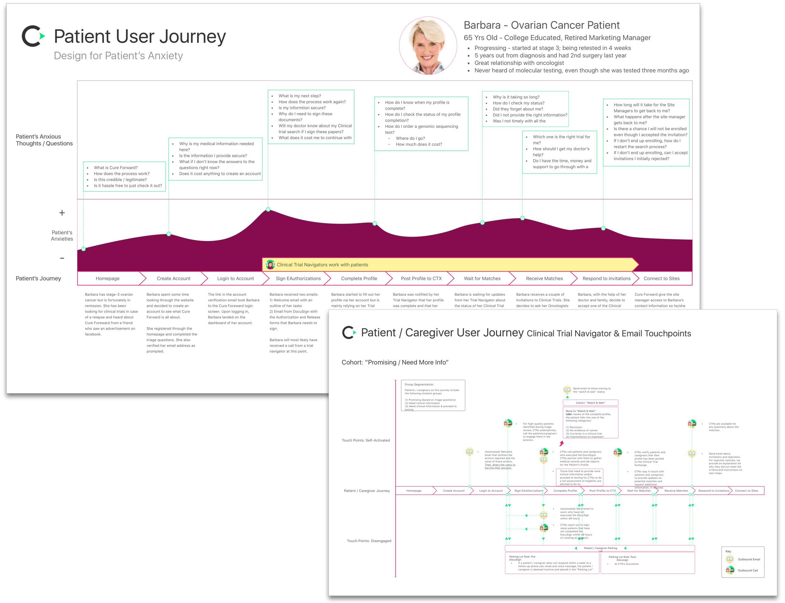
I started my time at Cure Forward developing a journey map of a patient’s engagement with us. This was a way to gain clarity into the business process and uncover opportunities for UX. It required a thorough analysis and revision of preexisting personas as well as interviews with representatives from marketing, sales, clinical operations and executive leadership.
The journey map made it clear that Cure Forward was not just a technological solution but a service that guided patients through a complex clinical trial space to access additional cancer treatment options. This process was daunting and anxiety inducing for the users, who are often undereducated, uncomfortable with technology and ill informed about their medical condition.
This journey map proved to be an excellent communication tool and an impetus for change in multiple different areas of the organization. It affected call scripts with patient, marketing copy, information architecture of the marketing site and of course the UX/UI of the user portals.
Redesigning Registration: Just Increasing Conversion is Not Enough
Iconography by Ian Chase
The Challenge
The existing registration needed to be revised to increase conversion while improving the efficacy and efficiency of the clinical operation. At the core of Cure Forward’s operation is the Clinical Trial Navigators who coach and guide patients through the complicated process of getting matched to a clinical trial. This is a high-touch and very personal process via phone, email and even text. With a growing number of registrations but a finite staff, it was paramount that we leverage our web platform to help the team quickly identify patients that (1) require immediate assistance and (2) have the highest chance of being enrolled into a clinical trial. Redesigning the registration flow was a thoughtful process to find the right balance between the business' needs and user's expectations, which often conflicted with each other.
The Outcome
The redesigned registration increased conversion by 256% and saved 60 hours a week for clinical operations (about 55 hours per week of call time and 5 hours per week of registration reviewing time).
My Approach
- Research / Competitive Analysis - I assessed the registration flow of competitors (I.E. Emerging Med and Antidote) as well as unrelated companies with analogous complexities such as Turbo Tax
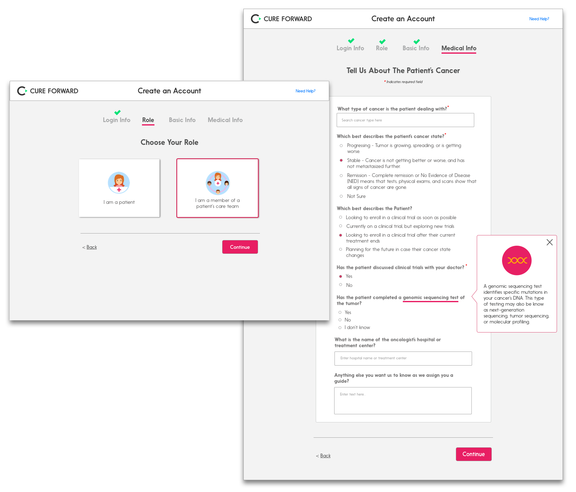
- Understanding the Users' Mental Model - Based on the competitive analysis and interviews with users, I assessed that our users are accustomed to getting quick access into a portal then exploring the product once logging in. Cure Forward could not take the same approach - at least not yet - so our goal was the make the registration simple and easy to fill out as well as helping users understand the value of completing our registration. The following are examples of tactics I implemented:
- Pagination of the registration flow and leading with the easiest set of questions
- Rephrasing clinical verbiage into more conversational language
- Tool tips for definitions and explanation for why the medical information is required during registration
- Nested / conditional questions based on role and cancer type, only when necessary
- User Testing with Proxies - I created a prototype using Invision and conducted usability tests with Patient Advocates, who are leaders in Cure Forward's patient communities
- Creating Wire Flows - A wire flow is a user flow with Mock-ups. This has proven to be an effective communication tool with stakeholders and development teams. It also speeds up the iterative design process and facilitates hand-offs.
Iconography by Ian Chase


