Project Overview
This was a three week UX consultation for a global financial software company headquartered in the Greater Boston Area.
I worked, as part of a team, with a global financial software company on redesigning a mobile application for its client facing professionals in the Private Equity/Finance and Real Estate Industries. Using the Jobs-To-Be-Done framework, we pivoted the company's mobile strategy from delivering an abridged desktop version to a workflow management and customer relationship management (CRM) tool. Solving for the users' tasks rather than targeting specific market cohorts mitigated challenges of continually adjusting for the company's changing user demographic.
Role: User Research | Ideation | Use case / User Journey Conception | Wireframes | Interactive Wireframes
Project Type: Adaptive Web App (Hardware Agnostic Design)
Design Toolkit: Paper & Whiteboard | Sketch | Invision
Resource: Customer-Centered Innovation Map by Lance Bettencourt & Anthony W. Ulwick
Deliverables: Competitive Analysis | Usability Testing | Site Map | User Journey | Wireframes | Interactive Prototype
The Challenge
Understanding the True Needs
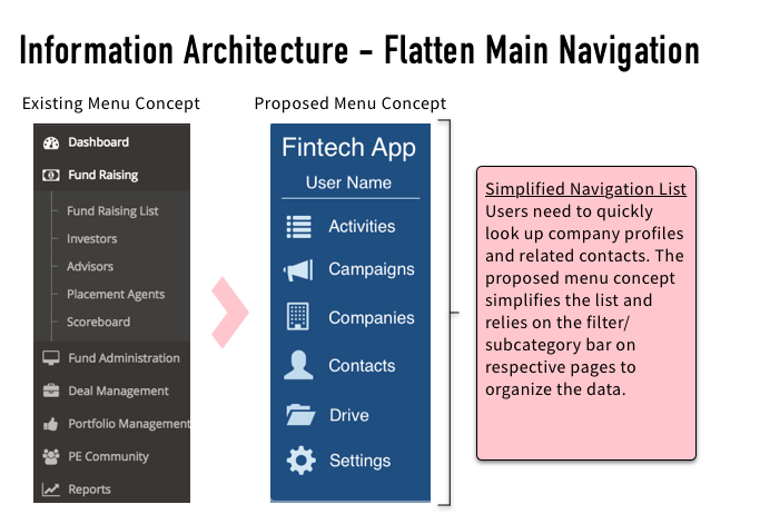
It was mission critical to understand the true needs of the client-facing professionals. Recognizing that mobile has a different use case, we had to be selective about employing existing desktop capabilities into the application and revamp the information architecture for ease-of-use on the go.
Positioning for the Shifting User Demographic
From a business standpoint, the design of the mobile application had to account for the changing user demographic while not alienating the large base of existing clients. Over the next 10 years, the millennial generation will become the primary users of the mobile application but delivering such a product now may negatively impact the baby-boomers and Gen-Xers who are currently the predominant users.
The Solution
Task-Oriented Not Market Segment
Through user interviews, surveys and my personal experience in the finance/real estate industry, my team and I were able to empathize with the end users and distill their true needs. We discovered that the users ultimately wanted to
Stay informed on all client activity/profiles while running from meeting-to-meeting
Then mobilize their team, at the office or others who are also traveling, in a timely fashion so that they can better execute on investment and/or fundraising opportunities
This pivoted our approach. We were now solving for the “jobs” that users were trying to accomplish rather than designing to target a market segment. Approaching the design from the “Jobs-To-Be-Done” framework made the solution cross generational and specific to the industry role.
Process Highlights
Empathizing with Limited Information
Despite being unable to find direct end-users early in our research phase, we were able to effectively empathize with the target audience via interviews with people in similar or related roles, competitive analysis and my personal experience in the industry. We were able to solicit participants towards the end of our design sprint, through which we validated and refined our original user journey and use case hypothesis.
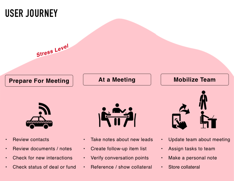
Below is the resulting archetypical user journey. In the infographic below, the peaks of stress are the major value-add opportunities for the mobile product.
Design Studios for Everyone
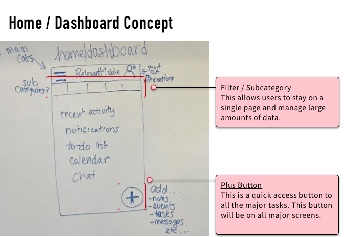
We are the UX experts but the CEO and the staff developers are the experts on their business and its customers. Therefore, it was important that we weave them into our process. We consistently updated the stakeholders on the results of our ideation/design studios to get their feedback and patch up any of our blindspots. Below is an image highlighting the cornerstone elements of our design.
Concept Validation and User-Testing
We developed a clickable wireframe to test two user flows based on the two major pain points that we discovered through our research:
Reviewing contact and company profiles while on-the-go
Taking a note then notifying relevant team members
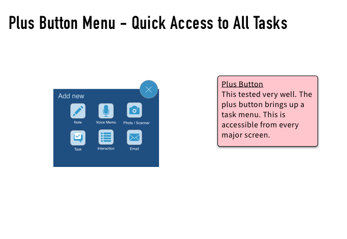
We tested the clickable wireframes with three customers. The user tests validated our concept of a task-oriented approach by noting that the features were applicable to their everyday use and they completed the tasks with relative ease. There were a few usability bottlenecks that were addressed with a few layout and terminology changes. The following are key screens from the clickable wireframe with annotations.


